As the Creative Director at Hennessey Digital, I’m responsible for leading a team of people to conceptualize, design, execute, and deliver on our clients’ hopes and dreams for their websites. Easy, right? And how do you design websites that convert and give the client what they want?
Complex problems require creative solutions, and Creative Services is so much more than logos and colors. (Although these are certainly part of it!) Creating a high-converting website or designing a memorable brand experience involves multiple steps and considerations. Everyone has an opinion on what they like and what they don’t like.
My primary mission is to make our clients’ websites convert. We do this through a multi-step process involving research, ideation, design, feedback, and working with other areas within Hennessey Digital to create the best possible end product.
How do you design a website to convert?

It’s my job to guide clients along the process of designing or redesigning their websites, helping them understand what works and what doesn’t. We say this often in the Creative team: what we like doesn’t matter. What matters is what converts!
A “conversion” is a website visitor doing what you want them to do on your site. This could mean filling out a lead form, clicking a button, or making a purchase.
SEO drives traffic to your website, but the right design gets it to convert.
Think of your website like a movie. The home page functions like a trailer for the movie: all the best content is front and center to capture a visitor’s interest and entice them to spend more time on the site.
The “hero” section of your home page, or the top area just below the navigation bar, is like a poster for your movie. It has to be a memorable snapshot of your brand and primary message so visitors have a strong visual association with your website.
People have short attention spans, and if you’re not grabbing a reader’s attention in the first three seconds they’re on your website, they’ll probably click away to a competitor’s site.
Start with research
Before we design a single pixel, we start with an in-depth research process. We meet with the client and talk about their firm, their existing branding and website, and discuss what they like about it and what they feel needs improvement. But most importantly, we talk about the client’s business goals and the feeling they want potential clients to have when they visit their website.
To design websites that convert, we research our clients’ markets and dig deep for information on the client. What do their online reviews look like? What are the firm’s clients saying about them? Are they known for a particular practice area? Have they secured big settlements for their clients? How do they present themselves on social channels?
Once we have a good understanding of the client’s business, we conduct competitive analysis to see what other firms in their space are doing. Everyone wants to stand out from their competitors, but there are some elements on law firm websites that work well and that we advise our clients to have on their sites.
When it comes to standing out, this is where the creativity of my team comes in. Each of our clients’ businesses has a distinct personality, work style, reputation, and goals they’re working towards. We want all of this to come across effectively on the client’s website so visitors can get a good feel for the law firm, what they stand for, and why they should represent them.
Visual design components
“Visual design” can mean many different things. For our Creative team, it’s all of the components that make up a client’s website. And because we don’t use templates at Hennessey Digital, each website is custom and clients get exactly what they want in their site design.
Above all, ease of use and user experience must be top of mind when designing or redesigning a website. If a site is difficult to navigate or has poor user experience, people won’t stay on it for long.
These are the main visual design elements we consider in creating a website that converts.
Fonts
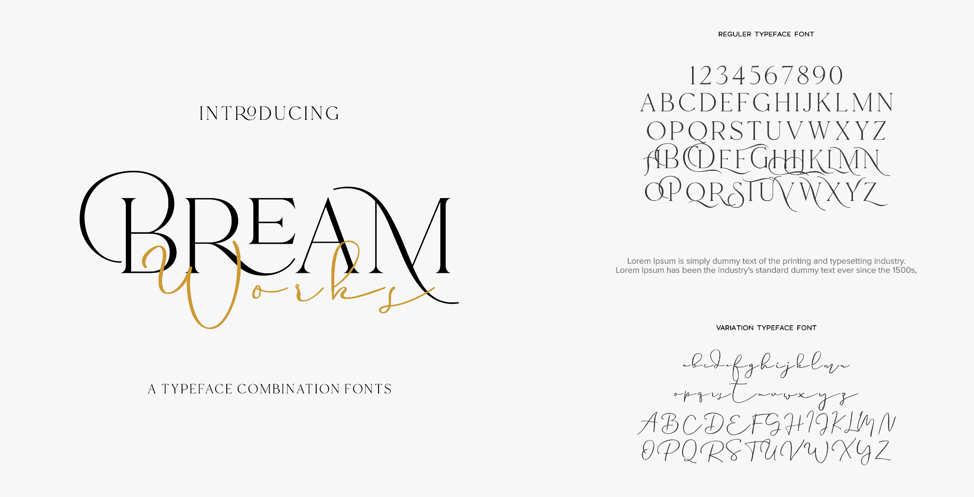
Fonts are more important than most people (non-designers, anyway) give them credit for. The right font family on a website can convey the right mood or tone we’re after.
Different fonts have different “feelings” to them. Some fonts are designed to communicate friendless while others are more strong or authoritative. We select the right fonts for the right message on a site, with each font performing a specific function. Some fonts are used for headlines or subheadlines, while others are used for normal text. We might use another font specific to buttons or calls to action.
Colors
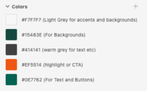
Just as in font choice, colors—and combinations of colors—can convey different moods. The majority of our clients come to us with brand colors already established. But what many businesses don’t consider is how to make colors work for them on their websites.
We usually focus on one to two main colors to feature on a website. Color palette choice will depend on the feeling the client wants to convey. Is it a darker, more authoritative tone? Lighter and friendlier?
A client’s brand colors should factor prominently into a website with accent colors that serve a specific purpose. For example, if a law firm’s brand colors are black and red, we may use a strategic third color to call attention to certain sections we want the reader to pay attention to.
Copy layout
How you lay out text on a web page is just as important as what the text says. If the copy on a website is really interesting and tells a great story but is visually arranged in a way that makes it difficult to read, it loses its impact.
Copy layout is perhaps the most crucial part of the visual design of a law firm website. Why do I say this? Because oftentimes, law firm sites have a ton of information to convey. If a website visitor sees a wall of text, their brain gets overwhelmed and they won’t read what’s there.
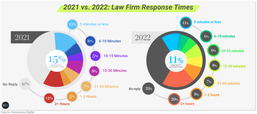
Just as is the case with copy, data layout is crucial to getting the reader to understand and digest what you’re presenting. Using fonts, colors, and spacing strategically helps guide the reader to pay attention to what you want them to look at, as in this example from our 2022 law firm response time study:
Calls to action
A call to action or CTA is what we want the visitor to do when they land on a website. Whether it’s making a purchase, completing a lead form, or responding to a survey, your call to action can incite or deter a visitor from converting to a customer.
Each of the visual design elements above come into play when designing an effective CTA. People want to be guided and shown what to do when they come to your website, so give them a clear, intuitive action to take once they’re there.
Client feedback and edits
Our goal is to get as close as possible to what the website should look like in our first design round. If we’ve done our research, asked the right questions, and understand the client’s goals correctly, this actually comes easy to us.
Conversion is always top of mind for our website designs. But making our clients happy is just as important. Sometimes what we personally like isn’t the best choice, and it’s our job to educate clients on what works and what doesn’t on a website. More quality leads and high-value cases is our clients’ number-one priority, and this guides our decisions when designing their site.
Post-design process
Once the client has approved their new website design, it’s time for next steps.
At Hennessey Digital, we know how crucial it is to work closely with the other functional areas working on our clients’ websites. SEO, web development, conversion rate optimization, and other areas affect the work we do in our department. All teams communicate frequently with each other to ensure designs are implemented correctly and the technical aspects of the site we’re creating are buttoned up.
One big factor to our clients’ success is whether their intake process is working properly. As we discovered last year and revealed new insights in our 2022 law firm response time study, some law firms will invest a lot in their SEO, site design, and conversion rate optimization. But without a solid intake team, you’re wasting money.
If you’re not there to answer the phone or if you don’t have an intake service to handle, track, and follow up with potential leads, all the organic traffic you’re getting to your website through investing in SEO is meaningless.
Our approach to websites that convert
The way we approach our work at Hennessey Digital may be different from other agencies, and this is by design. Because law firm digital marketing differs from other forms of marketing and SEO, we work a lot faster than most creative agencies. We have to be fast to respond to clients’ requests, changes, and additions to their websites so they can compete with other law firms out there.
Around here, we like to say that anyone can make a pretty website. A great website, however, tells a story that is memorable and is the result of research done up front before the design process begins.
Always consider function over aesthetics. User experience trumps unnecessary design. If your website isn’t intuitive and easy to navigate, it won’t convert.
There is no “magic dust” that conjures great creative work. The magic comes from understanding and empathizing with the client’s needs and goals, doing due diligence and research, and paying attention to the smallest details. This is what moves a website from good to great!


